
Close icons are more than mere design elements; they are crucial for seamless navigation and user interaction within apps. Their design and functionality can greatly impact the user experience. With a variety of styles and customizations available, selecting the appropriate close icon from a resource like Icons8 can set the tone for user engagement and app usability.
Understanding Different Close Icon Designs
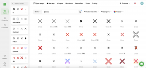
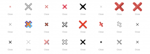
The design of a close icon can vary widely, and each type has its implications for user interaction:
- Basic ‘X’: This is the most recognizable form, used widely across all types of applications. Its straightforward design minimizes confusion.
- Circles and Arrows: These can soften the visual impact of a close icon and are often used in apps with a gentle, user-friendly aesthetic.
- Creative Symbols: For apps looking to stand out, incorporating unique symbols or thematic elements can add a distinctive flair.
Icons8 provides a vast array of these icon styles, allowing designers to choose or customize one that best fits the app’s theme and user expectations.
Platform-Specific Considerations
Each operating system may have its conventions and expectations regarding icon design:
- Android and iOS: These platforms have distinct design guidelines that should influence the choice of close icons, with iOS often favoring minimalism and Android offering more flexibility in design.
- Windows or Web Apps: These platforms traditionally adhere to more conventional GUI standards, though there is room for creativity.
Utilizing Icons8 can help ensure that the chosen icons adhere to these platform-specific guidelines while maintaining high design quality and consistency.
User Interface and User Experience Factors
The integration of close icons into the user interface requires careful consideration:
- Size and Color: The icon must be easily visible but not overpowering. High contrast with the background ensures visibility.
- Placement: Consistently placed in expected locations, typically the upper corners of the screen, helps with intuitive use.
Icons8 offers the ability to experiment with different sizes, colors, and placements through their customizable icon sets, enabling optimal user testing and adjustment based on feedback.
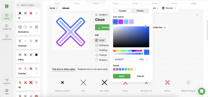
Customization and Brand Identity
Personalizing close icons can significantly enhance brand identity:
- Brand Elements: Incorporating brand-specific colors, logos, or designs can make close icons serve as part of the brand experience.
- Custom Designs: Icons8 allows designers to create custom icons that fully integrate the app’s branding, ensuring a unique and cohesive look.
These tailored solutions ensure that the app not only functions well but also resonates strongly with its intended audience, reinforcing the brand with each interaction.
Accessibility and Inclusivity
Designing for all users is crucial for broad app appeal and usability:
- Visibility: Ensuring that icons are visible to users with various visual abilities is crucial. This may involve selecting larger icons or those with more contrast.
- Comprehension: Icons should be universally recognizable or accompanied by clear textual or audio descriptions for users who rely on assistive technologies.
Icons8 supports accessibility by offering icons that can be customized for color, size, and design, ensuring that they meet various user needs and compliance standards.
Future Trends and Innovations
As technology evolves, so too do the expectations and capabilities of close icons:
- Emerging Technologies: With the growth of AR and VR, close icons could become three-dimensional or context-aware, offering users more immersive interactions.
- Interactive Elements: Adding elements such as animation or tactile feedback can make interactions more engaging and clear.
Staying current with trends and technological advancements through tools like Icons8 can help designers keep their apps at the cutting edge of user interface design.
Conclusion
Choosing the right close icon is a complex decision that involves balancing aesthetics, user expectations, and technological capabilities. By leveraging resources like Icons8, designers can access a wide range of options and customizations that enhance the functionality and appearance of their apps. This thoughtful approach ensures that the close icon not only looks appealing but also enhances the overall user experience, making app navigation effortless and intuitive.