
Phone icons play a vital role in enhancing user interaction within mobile applications. They serve as visual shortcuts, allowing users to quickly access functions without reading lengthy text. Effective phone icons can significantly improve the overall user experience by making navigation more intuitive and seamless. This article explores how to design phone icons that improve user interaction, focusing on best practices and essential principles. By incorporating well-designed phone icons, you can boost your mobile applications’ usability and aesthetic appeal.
Core Principles of Effective Phone Icons
To create phone icons that enhance user interaction, follow these core principles:
- Simplicity and Clarity: Phone icons should be easily recognizable and clearly convey their function. Avoid unnecessary details that might complicate the visual message. Simplicity ensures that users can quickly identify the icon’s purpose, reducing cognitive load and improving efficiency.
- Consistency with Overall App Design: Phone icons need to match the visual style and tone of the app. This includes using a consistent color palette, line thickness, and design language. Consistency helps create a cohesive user interface, making the app look professional and well-integrated.
- Scalability and Responsiveness: Phone icons must look good and remain functional at different sizes and resolutions. This ensures that they are effective on various devices, from small smartphones to larger tablets. Icons should be designed with scalability in mind to maintain their clarity and impact.
- Accessibility for All Users: Ensure that phone icons are accessible to users with visual impairments by using appropriate color contrast and providing alternative text descriptions. Accessibility is crucial for inclusivity, allowing all users to interact with your app effectively.
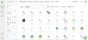
Using a resource like Icons8 can help you find phone icons that meet these characteristics. Icons8 offers a wide range of professionally designed icons tailored for various applications, ensuring that your icons are both functional and visually appealing.
Must-Have Phone Icons for Enhanced Interaction
Certain phone icons are essential for any mobile interface to ensure smooth user interaction:
- Call: Represents the phone’s primary function. Typically depicted with a handset symbol, this phone icon is essential for making and receiving calls. It should be prominent and easily recognizable.
- Message: Symbolizes text messaging. Commonly shown as an envelope or speech bubble, this phone icon directs users to their SMS or chat applications. It should be intuitive to users familiar with messaging services.
- Contacts: Indicates the user’s address book. Often shown as a person’s silhouette, this phone icon allows users to easily access and manage their contacts. It should convey the idea of a personal directory.
- Voicemail: This phone icon is used to access voice messages. Usually depicted with a tape or voicemail icon, it provides a visual cue for users to check their voicemail. It should stand out to ensure users do not miss important messages.
- Settings: This phone icon represents configuration options. Typically illustrated with a gear or cogwheel, it leads users to device or app settings for customization. It should be straightforward and easy to find.
- Notifications: A bell or alert icon is represented, informing users of new messages or updates. This phone icon needs to capture attention without being intrusive.
- Search: This phone icon, shown as a magnifying glass, enables users to find content quickly within the app. It should be immediately recognizable and easily accessible.
Icons8 offers a comprehensive collection of these core phone icons, ensuring you have high-quality, ready-made designs that are functional and visually appealing. Their extensive library can save you time and ensure consistency in your icon design.
Best Practices for Designing Phone Icons
To create phone icons that improve user interaction, adhere to these best practices:
- Using Intuitive and Recognizable Symbols: Ensure that phone icons are easily understood without additional labels. This reduces cognitive load and improves efficiency. Universally recognized symbols help users quickly grasp the icon’s purpose.
- Maintaining a Cohesive Visual Style: To create a unified interface, keep a consistent visual style across all phone icons. This includes maintaining uniformity in stroke width, color schemes, and design motifs. A cohesive style enhances the professional look of your app.
- Conducting User Comprehension Testing: Validate that users can correctly interpret the phone icons’ meanings through usability testing. Gather feedback to identify any ambiguities. Testing helps ensure that your icons are effective and intuitive.
- Iterating Based on User Feedback: Continuously improve phone icons based on user interactions and feedback. Iterative design processes help refine icons to better meet user needs and preferences. User feedback is invaluable for optimizing your icons.
Using tools like Icons8, you can access a vast library of phone icons that adhere to these best practices. Icons8 simplifies the design process by providing a wide range of icons that are already designed with these principles in mind, ensuring consistency and quality.
Tools and Resources for Icon Design
Utilize these tools and resources to aid in designing phone icons:
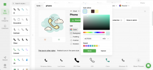
- Design Software: Adobe XD and Sketch offer robust tools for phone icon design, allowing you to create and customize icons with precision. These platforms provide the flexibility and features needed to design professional-quality icons.
- Icon Libraries: Icons8 and Font Awesome provide extensive collections of ready-to-use phone icons, saving time and ensuring quality. Icons8, in particular, offers a user-friendly platform with a wide range of customizable phone icons, making it easier for designers to find and adapt icons to fit their specific needs.
- Prototyping and Testing Tools: Use tools like InVision and Figma to create and test phone icon prototypes. These platforms enable you to simulate real-world usage and gather valuable user feedback. Prototyping tools help visualize how icons will appear and function in the final product.
Icons8 is an excellent resource for designers. It offers a vast library of high-quality phone icons and design tools. Their icons are customizable, ensuring that they can be tailored to fit your app’s specific style and requirements.
Case Studies: Icons That Enhance Interaction
Examining successful phone interfaces provides valuable insights into effective icon design:
- Apple iOS: Apple’s phone icons are minimalist and highly intuitive, setting a high standard for clarity. Their consistent use of simple, universally recognized symbols enhances user experience. Apple’s approach shows the power of simplicity and consistency in icon design.
- Google Android: Android phone icons are versatile and adaptive, showcasing excellent scalability and consistency. The Material Design guidelines emphasize clarity, simplicity, and color contrast. Android’s icons demonstrate the importance of adaptability and user-friendly design principles.
- WhatsApp: WhatsApp’s phone icons are straightforward and universally understood, enhancing user experience. Their design focuses on clarity and accessibility, ensuring that users can quickly identify and use key functions. WhatsApp’s success highlights the value of user-centered design in iconography.
Key takeaways from these examples include the importance of simplicity, consistency, and user-centered design. Icons8 offers case studies and examples of effective phone icon use, providing inspiration and guidance for your designs. Learning from successful implementations can help you refine your approach and create better icons.
Common Mistakes in Icon Design
Avoid these pitfalls when designing phone icons:
- Overcomplicated Designs: Complex phone icons can confuse users and detract from usability. Keep designs simple and focused on conveying a single, clear message. Overcomplication can make icons hard to recognize and slow down user interaction.
- Neglecting Accessibility: Ensure phone icons are accessible to all users, including those with visual impairments. Use appropriate color contrast and provide alternative text descriptions. Accessibility is crucial for inclusivity and ensuring a broad user base can interact with your app.
- Skipping User Testing and Feedback: Phone icons should be tested in various contexts to ensure they perform well in actual use. This includes different screen sizes, resolutions, and lighting conditions. Skipping this step can lead to icons not meeting user needs or expectations.
Icons8 offers tools and resources to help you avoid these common mistakes. It provides guidelines and best practices for accessible and user-friendly phone icon design. Their platform is designed to support designers in creating effective and user-centric icons.
Conclusion
Well-designed phone icons are essential for creating intuitive and efficient mobile interfaces. By following best practices and learning from successful examples, designers can craft phone icons that enhance the overall user experience. Icons8 provides a vast library of high-quality phone icons and design resources to help you achieve this goal. Apply these principles in your projects to improve navigation and user satisfaction, ensuring your app is both functional and visually appealing.