In today’s digital era, user experience plays a crucial role in the success of any website or application. As more people access the internet through various devices, including smartphones and tablets, website navigation has become a significant concern. To address this, designers and developers have turned to the use of hamburger menu icons. In this article, we will delve into the concept of hamburger menu icons, their design principles, their advantages and disadvantages, and how to use them effectively to enhance user experience.
In the digital world, website navigation is essential for users to explore and access the content or features they need. Traditional navigation menus, which are typically displayed at the top of a website, may not be the most practical solution for mobile devices with limited screen space. This is where the hamburger menu icon comes into play.
What are Hamburger Menu Icons?
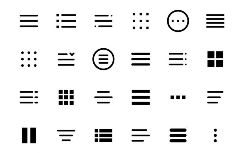
The hamburger menu icon is a three-horizontal-line symbol (☰) used to represent a hidden navigation menu. When users click or tap on the icon, it expands to reveal the menu items, providing a clean and uncluttered interface. Its name, “hamburger menu,” is derived from the resemblance of the three lines to layers of a hamburger.
The Origin of the Hamburger Icon
The origin of the hamburger icon can be traced back to the 1980s when Xerox Star, one of the early graphical user interfaces, used a similar icon to represent a “container” that concealed a list of items. Its adoption as a navigation element in modern digital interfaces gained traction in the early 2010s when mobile apps started to use it for responsive design.
Design Principles for Hamburger Menu Icons
1. Simplicity and Clarity
The primary purpose of a hamburger menu icon is to provide a simple and clear way to access additional navigation options. It is essential to ensure that the icon is easily recognizable and understandable by users across different demographics.
2. Icon Placement
The placement of the hamburger menu icon affects its visibility and accessibility. Typically, it is positioned in the top-left or top-right corner of the interface, where users are more likely to look for navigation options.
3. Icon Size and Spacing
The size of the hamburger menu icon should be large enough to be tapped or clicked comfortably, especially on touch-screen devices. Additionally, there should be enough spacing around the icon to prevent accidental taps.
Pros and Cons of Using Hamburger Menu Icons
1. Advantages
- Space Efficiency: Hamburger icons save valuable screen space, allowing more room for content.
- Aesthetics: They offer a clean and minimalist design, contributing to a visually appealing interface.
- Familiarity: Hamburger icons have become widely recognized, and users are accustomed to their functionality.
2. Disadvantages
- Discoverability: Some users may not be familiar with the hamburger icon’s purpose, leading to navigation challenges.
- Lack of Labels: Without labels, users might have difficulty identifying the menu items.
Best Practices for Using Hamburger Menu Icons
1. Limit the Number of Menu Items
To ensure a smooth user experience, it is advisable to keep the number of menu items within the hamburger menu to a minimum. Too many items can overwhelm users and defeat the purpose of simplification.
2. Include a Label or Tooltips
To address the discoverability issue, designers can include a label or tooltips that appear when users hover over the hamburger icon. This provides clarity about the icon’s function.
3. Test and Optimize
Designers should conduct usability testing to gather feedback and optimize the placement and design of the hamburger menu icon based on user preferences.
Alternatives to Hamburger Menu Icons
1. Tab Bar Navigation
Tab bar navigation places essential menu items at the bottom of the screen, making them easily accessible with a single tap. This is especially popular in mobile app design.
2. Bottom Navigation Bar
Similar to tab bar navigation, the bottom navigation bar keeps menu items visible at the bottom, offering a familiar interface for users.
3. Sidebar Navigation
Sidebar navigation displays the menu items on the side of the screen, providing more space for item labels and descriptions.
Future Trends in Navigation Design
As technology and user behavior continue to evolve, navigation design will also see new trends and innovations. Some potential future trends include…
Hamburger menu icons have become a widely used navigation element in modern digital interfaces, providing an efficient solution for mobile devices with limited screen space. Their simplicity and space-saving benefits make them an appealing choice for many designers. However, it is crucial to consider their discoverability and usability challenges and implement best practices to enhance user experience.
FAQs
- Are hamburger menu icons suitable for all types of websites? Hamburger menu icons work well for websites with a limited number of menu items. For complex websites with extensive navigation options, other navigation methods may be more appropriate.
- How can I make my hamburger menu more user-friendly? To make your hamburger menu more user-friendly, consider adding labels or tooltips to explain its functionality and conduct usability testing to gather feedback for improvements.
- What are some alternatives to hamburger menu icons? Tab bar navigation, bottom navigation bar, and sidebar navigation are popular alternatives to hamburger menu icons, each with its own advantages and use cases.
- Do hamburger menu icons affect SEO? When implemented properly, hamburger menu icons should not directly impact SEO. However, it’s essential to ensure that all menu items are accessible to search engines for proper indexing.
- Can hamburger menu icons be used in desktop interfaces? While hamburger menu icons are commonly used in mobile interfaces, they can also be used in desktop interfaces, especially for responsive designs that prioritize space efficiency.
Designing Effective Hamburger Icons
Introduction
In the ever-evolving digital landscape, effective navigation plays a pivotal role in providing users with a seamless browsing experience. One of the most popular navigation icons used today is the “Hamburger Icon.” In this article, we will delve into the world of hamburger icons, understanding their purpose, exploring their pros and cons, and learning best practices for designing them effectively.
What is a Hamburger Icon?
The hamburger icon is a simple, three-bar icon that resembles the shape of a hamburger, hence its name. It is commonly used in website and mobile app design as a compact way to represent a hidden menu.
The Purpose of Hamburger Icons
The primary purpose of hamburger icons is to save space on the screen while providing easy access to navigation options. When users click or tap on the icon, it reveals a hidden menu containing various navigation links and options.
Pros and Cons of Using Hamburger Icons
Pros
- Saves Space: Hamburger icons are particularly useful for mobile devices and responsive designs, where screen real estate is limited.
- Clean Aesthetics: They offer a minimalist and clutter-free design, keeping the focus on the content.
- Familiarity: Hamburger icons have become widely recognized, making them intuitive for users.
Cons
- Discoverability: Some users might not be familiar with the icon’s meaning, leading to a hidden navigation menu that they may not easily find.
- Labeling: Without proper labels, users might not know what options are available in the hidden menu.
- User Engagement: Hamburger icons may reduce user engagement if crucial navigation options are hidden away.
Best Practices for Designing Effective Hamburger Icons
To ensure the effectiveness of hamburger icons, consider the following best practices:
Keep it Simple and Recognizable
Ensure that the icon is easy to recognize and understand. Avoid complex designs that might confuse users.
Ensure Adequate Padding
Provide enough space around the icon to prevent accidental taps or clicks on neighboring elements.
Use Meaningful Labels
Accompany the hamburger icon with a clear label to indicate its purpose. For example, “Menu” or “Navigation” can improve user understanding.
Consider Placement and Size
Place the hamburger icon in a prominent location, such as the top corner of the screen, where users are accustomed to finding it. Adjust the size to maintain visibility without overwhelming the design.
Test and Iterate
Conduct usability tests to gather feedback from users. Iterate and make improvements based on their insights to optimize the icon’s design.
Alternatives to Hamburger Icons
While hamburger icons are prevalent, they are not the only option for navigation. Some alternatives include:
- Tab Bars: Commonly used in mobile apps, tab bars provide direct access to key sections of an application.
- Full-Screen Navigation: A fullscreen menu can be used for websites, making all options immediately visible.
- Tabbed Navigation: Suitable for organizing content into categories, tabbed navigation is ideal for mobile apps.
Case Studies of Successful Hamburger Icon Designs
Several websites and apps have achieved success with their hamburger icon implementations. For example…
(Include a few case studies of companies that have effectively used hamburger icons)
How to Implement Hamburger Icons Responsively
When designing responsive interfaces, adaptability is crucial. Ensure that the hamburger icon functions seamlessly on various devices, from large desktop screens to small mobile displays.
Future Trends of Navigation Icons
The world of web and app design is constantly evolving, and navigation icons are no exception. While hamburger icons continue to be popular, other innovative navigation patterns may emerge in the future.
Conclusion
Hamburger icons are a double-edged sword in the world of design. On one hand, they offer a compact and aesthetically pleasing navigation solution, while on the other hand, they can hinder discoverability and user engagement. By adhering to best practices and considering alternatives, designers can create effective and user-friendly hamburger icon designs that enhance the overall user experience.
FAQs
- Are hamburger icons suitable for all types of websites? While hamburger icons work well for many websites, they may not be the best choice for content-heavy sites where discoverability is essential.
- How can I make my hamburger icon more noticeable? Adding a subtle animation or using contrasting colors can draw attention to the hamburger icon.
- What is the ideal number of options in a hidden hamburger menu? It’s best to keep the options limited to the most essential ones to avoid overwhelming users.
- Do hamburger icons have an impact on SEO? Hamburger icons themselves do not directly affect SEO. However, poor navigation design can impact user experience, which indirectly affects SEO.
- Can I use hamburger icons on my e-commerce website? Yes, but it’s important to combine them with clear product categories and search functionality for better usability.
The Latest Hamburger Icons: Revolutionizing User Experience
Introduction
In the fast-paced world of web design and user experience, the hamburger icon has become an integral element. Over the years, this simple three-line symbol has evolved significantly, transforming the way users interact with websites and applications. In this article, we will explore the latest trends in hamburger icons and their impact on user engagement, accessibility, and overall design aesthetics.
Evolution of the Hamburger Icon
The Birth of a Simplicity – Hamburger Icon 1.0
Originally conceived by Xerox PARC in the early 1980s, the hamburger icon, also known as the “options” or “menu” icon, was designed to save precious screen space while providing easy access to secondary navigation options. With its three horizontal lines stacked on top of each other, it quickly gained popularity due to its minimalist and unobtrusive appearance.
Embracing Change – Hamburger Icon 2.0
As touch-screen devices gained prominence, the hamburger icon faced criticism for its lack of intuitiveness, especially for novice users. To address this, designers began experimenting with alternative iconography, such as the “three dots” or “grid” icon. However, the hamburger icon’s widespread recognition and established usage led to its continued dominance.
The Hamburger Controversy: To Use or Not to Use
The Argument for Hamburger Icons
Proponents of the hamburger icon argue that it saves valuable space, simplifies the user interface, and allows for a seamless transition between mobile and desktop designs. It enables a clean and uncluttered appearance, directing the user’s focus towards essential content.
The Rise of Alternative Navigation Patterns
On the other side of the spectrum, critics contend that hiding critical navigation options behind an icon can lead to reduced discoverability and hinder the user experience. In response to this concern, alternative navigation patterns, such as “tab bars” and “bottom navigation,” have gained traction, providing visible options without sacrificing screen space.
The Latest Trends in Hamburger Icon Design
Animated Hamburger Icons
To enhance user engagement, modern designers are incorporating animation into hamburger icons. Subtle yet purposeful animations, like morphing into an “X” or transforming into a back arrow, provide visual cues and delight users during navigation.
Adaptive Hamburger Icons
Recognizing the need for context-awareness, adaptive hamburger icons are emerging as a popular trend. These icons dynamically change based on the user’s interaction with the application, revealing relevant options and promoting a more personalized experience.
Hamburger Icons with Labels
To address the icon’s discoverability concerns, some designers are pairing hamburger icons with text labels. This approach ensures that users clearly understand the icon’s purpose and can easily access navigation options.
The Impact on User Experience and Accessibility
Improved User Engagement
With the evolution of hamburger icons, user engagement has seen positive outcomes. The incorporation of animations and adaptive designs has made navigation more intuitive and enjoyable, leading to increased user retention and satisfaction.
Accessibility Considerations
While hamburger icons have come a long way, accessibility remains a challenge. Screen readers and users with disabilities may face difficulties in identifying the hamburger icon’s function. Designers must strive to provide alternative text and labels to make the icon more inclusive.
Best Practices for Hamburger Icon Implementation
- Maintain Visibility: Ensure that the hamburger icon is easily identifiable and consistently placed throughout the application.
- Combine with Other Navigation Patterns: Consider using the hamburger icon in conjunction with other visible navigation elements for a seamless user experience.
- Test and Iterate: Conduct usability testing and gather feedback from users to refine the icon’s design and placement.
Conclusion
The hamburger icon has evolved from its humble beginnings into a powerful symbol of modern web design. Its journey from being a space-saving icon to an engaging and adaptive design element reflects the continuous efforts of designers to enhance user experience. While alternative navigation patterns continue to challenge its dominance, the hamburger icon remains a crucial part of the digital landscape, connecting users with the content they seek effortlessly.
FAQs
1. What is the purpose of the hamburger icon? The hamburger icon serves as a compact and minimalist symbol to access secondary navigation options without cluttering the user interface.
2. Are there any alternatives to the hamburger icon? Yes, alternative navigation patterns, such as “tab bars” and “bottom navigation,” provide visible options without hiding critical navigation behind an icon.
3. How can I improve the discoverability of the hamburger icon? Pairing the hamburger icon with text labels can enhance its discoverability and ensure users understand its purpose.
4. What are adaptive hamburger icons? Adaptive hamburger icons dynamically change based on the user’s interaction, revealing relevant options and personalizing the user experience.
5. How do animated hamburger icons enhance user engagement? Subtle animations provide visual cues during navigation, making the user experience more intuitive and enjoyable.
Enhancing Hamburger Menu UX
Introduction
In the digital age, where websites and applications cater to diverse audiences, creating an intuitive user experience (UX) has become paramount for businesses. A significant element of UX design is the Hamburger Menu, which has become a staple in modern web and app development. This article aims to explore the concept of Hamburger Menus, their pros and cons, and most importantly, how to enhance their UX to provide seamless navigation and interaction for users.
The Evolution of Hamburger Menu
The Hamburger Menu, also known as the three-bar menu, has an interesting history. It was first introduced by designer Norm Cox in the 1980s for the Xerox Star, but its popularity soared in the early 2010s when mobile apps adopted it as a space-saving navigation solution. Over time, its usage expanded to desktop websites, making it a common sight across various digital platforms.
The Pros and Cons of Hamburger Menus
Hamburger Menus offer several advantages, such as decluttering the interface, allowing easy access to secondary options, and maintaining a minimalist design. However, they also have some drawbacks, including reduced discoverability and the potential to hide critical content from users. It’s essential for designers to carefully weigh these factors before implementing a Hamburger Menu in their projects.
Enhancing Hamburger Menu UX
To ensure a delightful user experience, designers must employ specific techniques to enhance the Hamburger Menu’s usability. Firstly, the placement and visibility of the menu should be prominent, so users can easily spot and access it. Additionally, using clear and concise labels instead of solely relying on icons can eliminate ambiguity. Speaking of icons, choosing the right ones and maintaining consistency in their use contributes to better user comprehension.
Best Practices for Hamburger Menu Navigation
Creating an efficient Hamburger Menu goes beyond aesthetics. Limiting the number of items in the menu and grouping related options together can prevent overwhelming users. Integrating search functionality within the menu can further streamline navigation, especially for content-heavy websites. Moreover, employing personalization and contextual menus can cater to individual user preferences, enhancing the overall experience.
Mobile vs. Desktop UX Considerations
While Hamburger Menus work well on mobile devices, their implementation on desktop websites requires thoughtful consideration. Designers should be mindful of the different user behaviors and expectations on each platform. Adapting the Hamburger Menu to suit the larger screen and ensuring it aligns with desktop navigation patterns is crucial.
Accessibility and Hamburger Menus
Maintaining accessibility is a fundamental aspect of UX design. For Hamburger Menus, designers can add ARIA labels and roles to make them more accessible to screen readers and assistive technologies. Additionally, optimizing keyboard navigation and focus states ensures that users can interact with the menu efficiently using only the keyboard.
Measuring and Improving Hamburger Menu UX
Continuous improvement is vital in UX design. Regular user testing and feedback collection help identify pain points and areas of improvement. Data analysis provides insights into user interactions, allowing designers to make informed decisions for a more refined UX.
Alternatives to Hamburger Menus
While Hamburger Menus are popular, they may not be the best fit for every website or app. Alternatives such as tab bars, bottom navigation, and expandable menus offer unique ways to present navigation options. Mega Menus, which display a comprehensive set of choices, can also be a viable alternative for content-rich websites.
The Future of Hamburger Menus
As technology advances, so will UX design trends. The future of Hamburger Menus might witness innovative ideas, such as gesture-based navigation or AI-driven contextual menus. Staying updated with emerging trends will be crucial for designers seeking to push the boundaries of user experience.
Conclusion
Enhancing Hamburger Menu UX is essential for creating user-friendly digital interfaces. By prioritizing visibility, clear labeling, and smooth animations, designers can optimize Hamburger Menus to maximize user engagement. Moreover, regularly analyzing user behavior and feedback will lead to continuous improvements and an overall enhanced UX.
FAQs
- What is a Hamburger Menu? A Hamburger Menu is a navigational element represented by three horizontal lines, typically used to hide menu options in a collapsible manner.
- Why do some websites avoid using Hamburger Menus? Some websites avoid using Hamburger Menus because they may hinder discoverability, and important content might remain hidden from users.
- How can animation enhance the Hamburger Menu experience? Subtle animations can provide visual cues and feedback, making the Hamburger Menu more engaging and user-friendly.
- Are Hamburger Menus suitable for all types of websites? Hamburger Menus work best for simple and content-light websites. For complex sites, alternative navigation options may be more suitable.
- What are the best practices for ARIA labels in Hamburger Menus? Using appropriate ARIA labels and roles ensures that the Hamburger Menu is accessible to users with disabilities, aiding their navigation experience.
Enhancing Symbol Readability: Making Your Message Clear and Impactful
Introduction
In today’s fast-paced world, effective communication is crucial, and symbols play a significant role in conveying information quickly and efficiently. Whether in marketing, user interfaces, or educational materials, symbols can transcend language barriers and deliver messages with clarity. However, symbol readability is often overlooked, leading to misunderstandings and misinterpretations. In this article, we will explore the importance of enhancing symbol readability and provide practical tips to make your symbols more effective in conveying your message.
The Power of Symbols in Communication
The Role of Symbols in Human History
Throughout history, symbols have been an essential part of human communication, dating back to ancient civilizations. From cave paintings to hieroglyphics, symbols have conveyed information and stories across generations.
The Impact of Symbols in Modern Communication
In the digital age, symbols have taken center stage due to their effectiveness in conveying information quickly. From emojis to icons in user interfaces, symbols are ubiquitous in our daily lives.
Factors Affecting Symbol Readability
Clarity and Simplicity
One of the key factors in enhancing symbol readability is ensuring that the symbol is clear and straightforward. Complex symbols can lead to confusion and may not be universally understood.
Cultural Relevance
Symbols can hold different meanings in various cultures, making it essential to consider cultural relevance when designing symbols for a global audience.
Color and Contrast
Choosing the right colors and ensuring sufficient contrast can significantly impact symbol readability, especially for individuals with visual impairments.
Context and Placement
The context in which a symbol is used, as well as its placement, can influence how it is perceived and understood.
Strategies for Improving Symbol Readability
Conducting User Testing
User testing is a crucial step in evaluating the effectiveness of symbols. Gathering feedback from users helps identify potential issues and allows for iterative improvements.
Utilizing Universal Symbols
Incorporating universal symbols that are widely recognized across cultures can enhance the accessibility and understanding of your message.
Optimal Size and Scaling
Selecting the appropriate size for symbols and ensuring they scale well across different mediums and devices is vital for consistent readability.
Creating Consistency in Symbol Design
Maintaining a consistent design language for symbols within a brand or project fosters recognition and familiarity among users.
The Psychology of Symbol Perception
Cognitive Associations
Symbols often evoke cognitive associations, and understanding these associations can help design symbols that resonate with the intended audience.
Emotion and Symbolism
Symbols can evoke emotions and convey powerful messages without relying on words. Harnessing this emotional aspect can make symbols more impactful.
Practical Applications of Symbol Readability
Symbol Design for Marketing and Branding
In marketing, symbols can be used to reinforce brand identity and communicate core values, making it crucial to ensure they are easily understandable.
Symbols in User Interfaces
User interfaces heavily rely on symbols to guide users through different functions. Ensuring clarity in symbol design enhances user experience.
Symbols in Educational Materials
In educational materials, symbols can aid comprehension and retention, particularly in subjects that involve complex information.
Conclusion
Enhancing symbol readability is a fundamental aspect of effective communication. By prioritizing clarity, cultural relevance, and cognitive associations, symbols can transcend language barriers and deliver impactful messages. Whether in marketing, user interfaces, or educational materials, symbols have the power to convey information in a concise and engaging manner.
FAQs
- How can I create culturally relevant symbols? To create culturally relevant symbols, research and understand the target audience’s cultural context and symbolism.
- What tools can I use to design symbols? There are various graphic design software available, such as Adobe Illustrator and Sketch, which are suitable for creating symbols.
- Are there any symbols that have universal meanings? Yes, symbols like the heart symbol for love and the thumbs-up symbol for approval are widely recognized across cultures.
- How do symbols affect website accessibility? Symbols with clear contrast and appropriate sizing contribute to website accessibility for all users, including those with visual impairments.
- Can symbols enhance learning in children? Yes, symbols can aid children’s learning by providing visual representations of concepts and making information more engaging.
Remember to keep these tips in mind when designing symbols to ensure that your message is conveyed clearly and effectively. Happy symbol designing!
Modern Symbolism in Web Design
In today’s digital era, web design goes beyond aesthetics and functionality; it has evolved into an art form that communicates messages and emotions to users. One of the significant aspects of modern web design is symbolism, which employs visual elements to convey deeper meanings. This article explores the growing importance of symbolism in web design and its impact on user experience and brand identity.
In the vast landscape of the internet, where millions of websites compete for attention, creating a memorable and engaging user experience is vital for success. This is where symbolism comes into play. Symbols have been an integral part of human communication for centuries, and their incorporation into web design allows designers to evoke emotions, convey information, and establish connections with users on a subconscious level.
What is Symbolism in Web Design?
Symbolism in web design refers to the intentional use of visual elements, such as icons, colors, and typography, to represent ideas, concepts, or emotions. It adds layers of meaning to the design, making it more appealing and intriguing to users. By utilizing symbols, designers can communicate complex messages in a concise and accessible manner, enhancing the overall user experience.
The Role of Modern Symbolism in Web Design
Enhancing User Experience
Symbols play a pivotal role in enhancing user experience by making websites more intuitive and user-friendly. For instance, the “hamburger” icon universally represents the menu, allowing users to navigate effortlessly. Similarly, familiar symbols used consistently across websites reduce cognitive load, leading to a smoother browsing experience.
Building Brand Identity
In the competitive digital landscape, establishing a strong brand identity is crucial for businesses. Modern symbolism in web design allows brands to create visual representations of their values and principles. Consistent use of brand symbols fosters brand recognition, building trust and loyalty among users.
Communicating Subtle Messages
Symbols have the power to communicate abstract concepts subtly. For example, the use of specific colors or shapes can evoke emotions or associations that align with the brand’s message. Cleverly crafted symbols enable designers to convey deeper meanings without relying solely on written content.
Common Symbols Used in Modern Web Design
Icons and Logos
Icons and logos are prevalent symbols in web design. They serve as visual shortcuts to represent actions, products, or services. Well-designed icons can significantly contribute to a website’s aesthetics and usability.
Colors and their Meanings
Colors carry psychological significance and can evoke various emotions. Designers carefully select color palettes to align with the brand’s personality and evoke specific feelings in users.
Typography Choices
Typography plays a vital role in conveying the tone and message of a website. Different fonts evoke different feelings, making typography an essential aspect of modern web design symbolism.
The Psychology of Symbols in Web Design
Emotional Impact
Symbols have the ability to trigger emotional responses from users. By tapping into the psychological aspects of symbolism, designers can create a more profound impact on the audience.
Cognitive Association
Symbols help users form cognitive associations between the visual representation and the intended meaning, aiding in memory retention and recall.
Cultural Relevance
Understanding the cultural context is essential when using symbols. What may be positive in one culture might have negative connotations in another.
How to Use Symbols Effectively in Web Design
Consistency and Clarity
Consistent use of symbols throughout the website ensures a smooth user experience. Clarity is equally important, as users should easily understand the intended meaning of symbols.
Context Matters
While symbols can be powerful communicators, their meaning can be context-dependent. Designers must ensure that symbols are relevant and appropriate for the content and target audience.
Avoiding Overwhelm
Using too many symbols or complex ones can overwhelm users. Simplicity is key to effective symbolism in web design.
Case Studies: Brands Mastering Modern Symbolism
Apple Inc.
Apple’s use of the iconic apple symbol on its website represents simplicity, innovation, and a user-centric approach, aligning perfectly with the brand’s core values.
Nike
The iconic “swoosh” symbol of Nike is a powerful representation of motion, energy, and aspiration, encapsulating the brand’s message of “just do it.”
Airbnb
Airbnb’s clever use of its logo, “Bélo,” symbolizes belonging, hospitality, and diversity, fostering a sense of community among users.
Future Trends in Symbolism and Web Design
As technology advances and user preferences change, symbolism in web design will continue to evolve. Designers may explore new ways to incorporate augmented reality or interactive symbols to create immersive experiences.
The Power of Simplicity
In a world full of distractions, simplicity in web design can be a powerful differentiator. Minimalistic and well-thought-out symbols will continue to have a significant impact on users.
Conclusion
In conclusion, modern symbolism in web design is a creative and effective tool to enhance user experience, build brand identity, and communicate messages. By understanding the psychological and cultural implications of symbols, designers can create meaningful and engaging websites that leave a lasting impression on users.
FAQs
- What is the role of symbolism in web design? Symbolism in web design enhances user experience, builds brand identity, and communicates subtle messages.
- How do symbols impact user emotions? Symbols have the power to trigger emotional responses from users, creating a deeper connection with the website.
- What are some common symbols used in web design? Common symbols in web design include icons, logos, colors, and typography choices.
- How can symbols be used effectively in web design? Symbols should be used consistently and clearly, considering cultural context and avoiding overwhelming users.
- What is the future of symbolism in web design? As technology advances, designers may explore new ways to incorporate augmented reality or interactive symbols for immersive experiences.